Role: UX & UI Design
Portfolio
Piedmont Health - Website Redesign
Project brief: Common Impact is an organization that pairs skill-based volunteers with local non-profit business through Tech Impact Days. I worked with Piedmont Health Services (PHS), a healthcare provider with 12 locations in North Carolina. Their mission is to reduce barriers and provide quality healthcare for low-income, vulnerable, and underserverd populations. PHS knew their website wasn't serving their users well, and they wanted to be sure they were communicating effectively with existing and especially prospective patients. They feared they were perceived by prospective patients as low-quality and only for those on Medicare/Medicaid, when actually PHS is an innovative and authentically heartfelt organization that has won awards for the services it provides to patients and the community.
Who, me?
I had signed up just to be a participant, but a couple days before the event, the person who was supposed to be the team lead on the Fidelity side had some urgent work come up, and so in the vacuum I stepped into the lead role with very little preparation or ideas of how to proceed. Bud I did have one ace up my sleeve, and that was that I had recently learned about “Jobs to be Done” (Alan Klement) so I knew that a simple “coat of paint” on their site likely wouldn’t solve anything, so my one goal for the 4 hours was to identify a couple key problems and then come up with some solution suggestions that the PHS folks could take back and implement.
Out of that session, we used the Jobs To Be Done framework to narrow down to key user groups and their main needs when coming to the website.
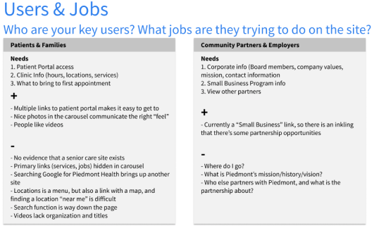
After a furious 4 hours, we had come up with 7 key takeaways that were geared to solve specific problems that had been brought up, and that could be implemented with minimal work since PHS had no in-house web developers and a very small budget to make improvements. We had looked at various other healthcare providers’ website, identified PHS key users (prospective patients), and asked questions, some of which can be seen here along with their existing home page at the time:
Even given the short time we had, and the limited amount we were able to do, the PHS folks were very grateful for my team’s work and suggestions, and the day was declared a success!
Not finished yet...
As providence would have it, the project didn’t end on Tech Impact Day. A couple months later, as a result of the overwhelmingly positive feedback received form the local businesses, Common Impact and Fidelity chose to extend a few of the projects from the Tech Impact Day, and PHS was one of them. I got an email from the Fidelity coordinator saying PHS wanted to continue the work for their whole site, and that they had asked for me and one other person from the original team by name, which was an honor to be sure! So I reached out to the rest of my previous team, and a couple said they’d join, but as it turned that about a month into the 2-3 months allotted, all the others hadn’t been able to make any of the working sessions, so I carried on by myself, determined to deliver to PHS what they needed.
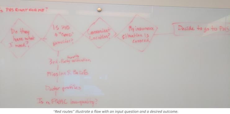
Before my team split up, we did manage to hold a focus session where we identified the “red routes,” a concept I had recently learned from my UXD mentor, which are the most important user flows that the website needed to support. In a nutshell, these all centered around answering the question, “Is PHS right for me?” This theme would continue to carry through all the rest of the changes and create a unified message to the website visitor.
Focusing on root problems
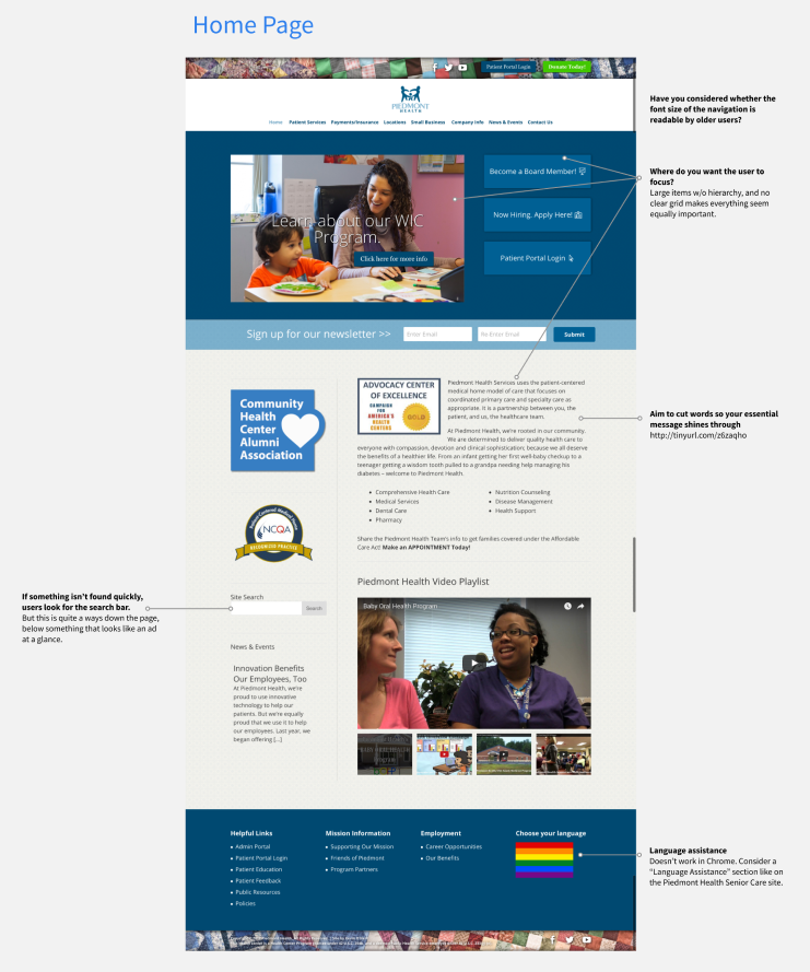
The PHS site had a number of issues, but they could all be summed up as having a lack of focus and direction. The home page had an odd quilt motif above the nave, a carousel with random services, and a couple that went to the same location; the things that shouted the loudest weren’t necessarily the most important; and things new visitors would commonly want to see, such as locations, payment information, and how to make an appointment, were not obvious or were hidden. Other features, such as multi-language support, were hinted at, but didn’t actually work. The majority of pages were nothing more than text and bullets, sometimes repeating information with other pages, or unnecessarily linking to other pages. Some pages obviously hadn’t seen any updates in months.
So over the next couple months, I worked to improve the clarity and adjust the design so that the critical routes were easy to follow, and also so that Piedmont’s unique outlook and heritage of really loving their patients came out much stronger. Each week I met with the lady on the PHS side to share progress, get feedback, and plan what would be worked on for the next week. Without even knowing it or giving it a name, I was working in a more-or-less Agile environment, and it was really great. Yes, there was a vision of the end-product, but it wasn’t just this huge list of features broken down to 1-week chunks; it was try something, learn something, change something, repeat!
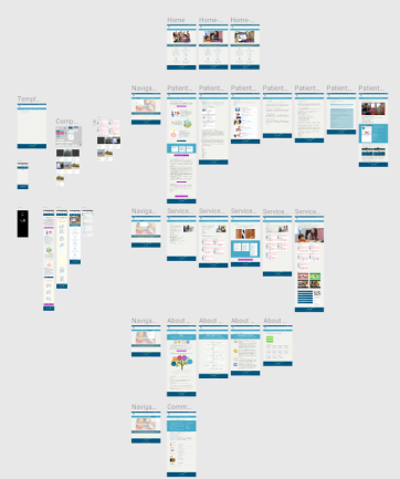
I ended up pretty much mocking up new layouts and designs for every page of their website in those couple months, even though the overall design theme never changed (I never touched things like their color palette or layout), although I did propose some fairly significant changes to navigation, and importantly determined a number of pages that could be removed altogether, thus simplifying the site.
Here’s a super-high level view of some of the screens that were involved in this effort:
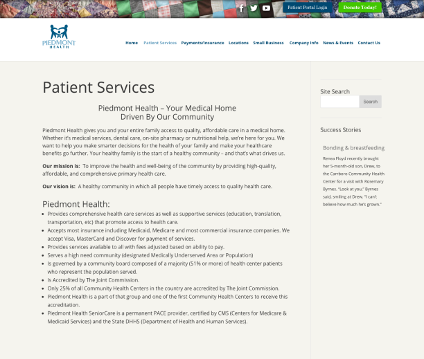
The next image illustrates one of the main reasons for the makeover, and it's a page that underwent a big transformation. This is the main page that outlines the offered services. It should answer the questions prospective patients might have, and move them closer to considering PHS as the right place for them to call their health provider home. But it is just a wall of text. Good text, and helpful to be sure... if the user actually reads all the way through it.
Before:
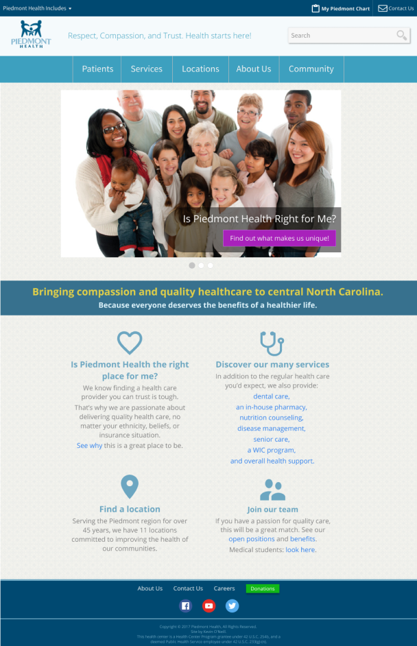
After:
Sendoff
As a parting shot, below is the redesigned home page. If you recall the first image of the home page above, with all its badges and so many things (most relatively unimportant) calling for attention that nothing really stood out, you probably noticed how hectic it felt. I know that when I first saw it, didn’t inspire me to even consider checking them out as a potential healthcare provider. It felt more like what you’d expect from a minute-clinic that just opened its doors and only had one nurse who was a transfer from a third-class veterinary school, and not the website of an established local business with 20+ years of providing quality health care to all types of community citizens.

A Positive Reception
After months of work on the site, I finally had the opportunity to present my recommendations and the new look to Piedmont executives and other employees. I walked through the process we had gone through, explaining the goals of the redesign and how it would better serve the user types that were most important to them. The presentation was very well received and the folks at Piedmont Health Services were extremely grateful for help in streamlining the site so that they could better reach out to the people in the community that they have a passion for.
I learned a lot from the project, and while I probably won’t be looking for opportunities to do a solo whole-site redesign anytime soon, I too was grateful for their trust in me, and for Fidelity’s continuing commitment to being a great community partner that gave me the opportunity to work on this project. And after learning all about PHS, I was ready to switch over to them as my primary care provider!