Role: UX & UI Design, Front-end development (Angular)
Portfolio
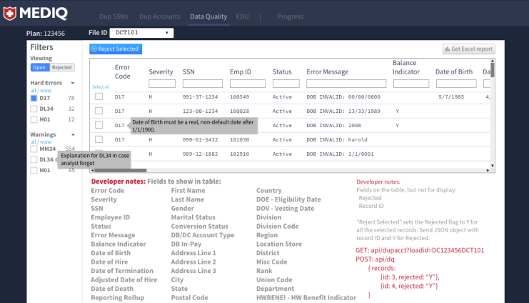
Mediq - Web Application
Project brief: MEDIQ started life as a Microsoft Access application, and was in use for approximately 10 years. There were actually dozens of copies, one for each new client. It could be quite slow depending on the amount of data, and it hadn’t been updated in years. The ask was to replace them with one web app utilizing a proper database, that could provide fixes and additional features as necessary. The team featured myself in the aboved named role, one database/ETL person, and one person to write the Spring API.
Overview
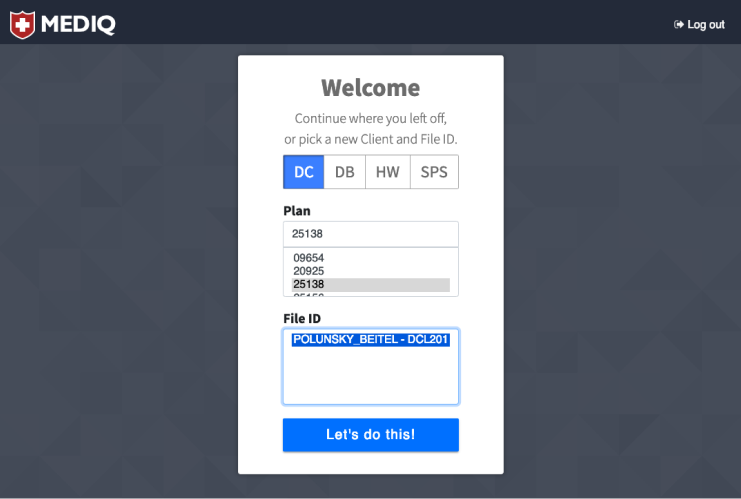
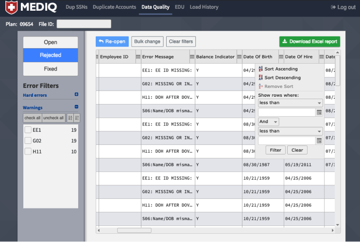
Below are some screen shots from the Access tool. One of its biggest failings in my opinion was that it provided no guidance of flow for the user. You had screens of buttons and options, but no specified order of operations, which would have been fine if it didn’t matter what order you did things in, but it did.
One of the things I did very early on in this project (or tried to do), was a design sprint with the users. If you haven’t heard of design sprints, it’s a ideation and problem-solving technique first designed at Google Ventures and now detailed in a book called “Sprint: Solve Big Problems and Test New Ideas in Just Five Days” by inventor Jake Knapp. The challenge with this (actually, there were several), is that, this being an internal tool, one of the key users was also the appointed “Decider” for what would be in the tool and what wouldn’t make the cut. So a bit of conflict of interests perhaps, but it was what it was. The other difficulty was in getting a mere 7 people together for the suggested 5 days. Though in hindsight (but as I expected) 5 days spent in focused problem-solving would have saved that amount many times over, it proved to be impossible to schedule, so I suggested maybe three days, then two, but ended up scheduling about 6 hours, and even that was remarkably hard (someone should do something about all these meetings that take up everyone’s time).
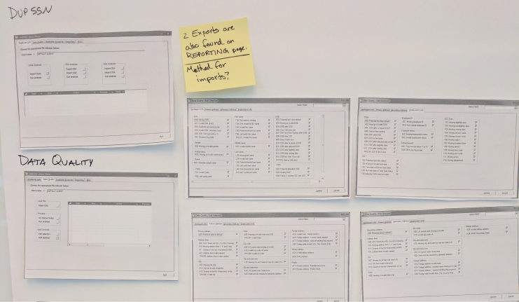
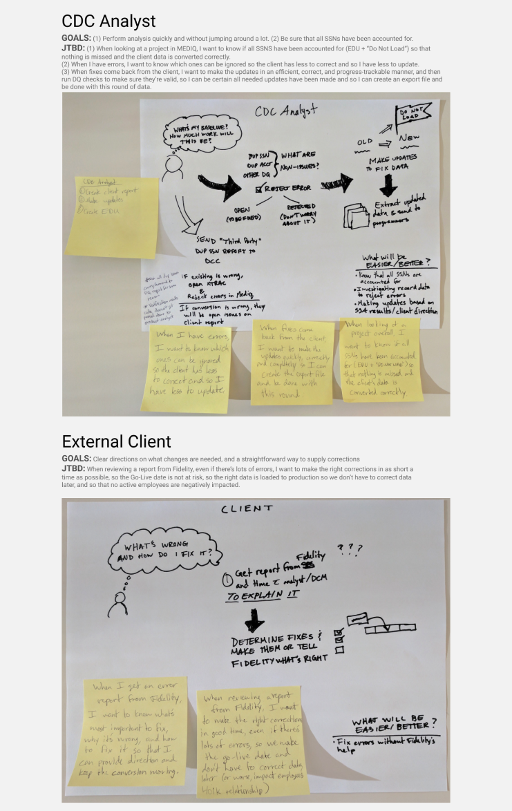
However, any time was better than no time, and that extremely abbreviated “Sprint” brought out many unspoken assumptions, questions, and resulted in some important decisions being made. One of the first outputs was a simple flow of the process the users employed today that would have to be accommodated in the new tool:
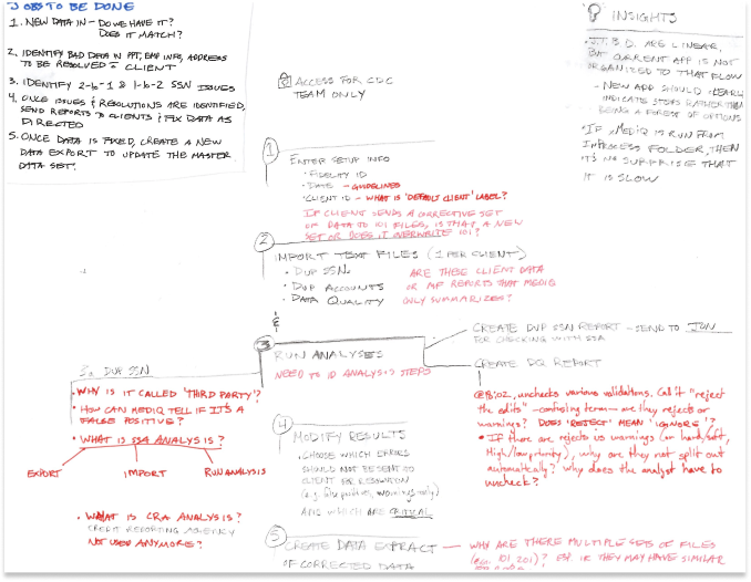
Features to be built, or jobs to be done?
As the drawing above hints at, one of the other things I latched on to about this time was the powerful Jobs to be Done (JTBD) method of thinking that was pioneered by Clay Christensen and wonderfully laid out in an insightful and fun way by Alan Klement in his book “When Coffe and Kale Compete.” The gist of this method is that user personas can be misleading, and are often a fake representation of what someone thinks the “ideal user” is, and so instead we should focus on the problem that a person is trying to solve in some way (the job to be done). I found this framework to be extremely helpful in phrasing the need compared to the typical “user story” which in my experience usually sounds something like “As a user, I want to do XYZ so that XYZ is done.” Often the story details the implementation, leaving designers and developers with little room for innovation because they’ve already been told what all the requirements are. Contrast that with a “job story,” which outlines a situation where someone, a real person, has a motivation to make their life better in some way. An example could be:
“When I'm looking for a new car, I want to be able to prioritize some features over others so that I can see cars that include my most important features, but maybe only some of the ones I deem less important.”
So, with my newfound knowledge, I set about applying it to each of the core (real) users of MEDIQ and created what I called “Outcome Cards” for each that focused on that user’s concerns and goals. Here’s a couple examples:
Getting to the UI
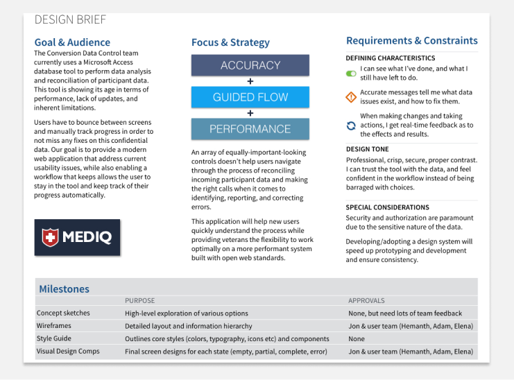
About the same time, being that I was wearing multiple hats, I started thinking about the priorities for the design of the new tool from a user experience perspective, so I created a design brief to help communicate those ideals.
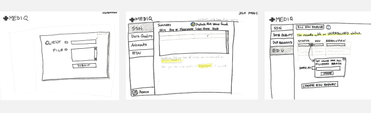
After this work was done, I felt I could start putting pen to paper (literally) and start sketching out some ideas to talk over with the user team. Again, since they were internal, we met at least once a week to go over things and work on building a shared understanding.
Initial sketches were pretty rough, which was on purpose of course, being that they were meant to foster discussion around content and flow, not colors and font sizes.
I redid sketches multiple times, both to practice as I’d always been one to jump into a design program, but also because I knew it was quicker. I enjoyed iterating through drawings, and they went from extremely rough to a little less rough...
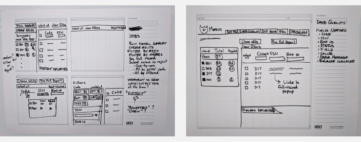
…and then moved on from that to digital renderings:
Learnings & Takeaways
I had used Ember.js on a previous project, but as I knew others in Fidelity were using Angular, and since React was not yet an approved open-source library, I dove into Angular. As a side note, through various podcasts and web developer newsletters I subscribe to, I also learned about utility-first CSS, and started using it on this project. It was an eye-opening experience, and I made for a great development experience. If you do anything with CSS, I highly recommend it! (I used the Tachyons library for this project, but in the future will use Tailwind CSS).
One of the things this project taught me was how much time can be spent at this stage. Being that it was detailed work, I found it fun, so it was easy to keep tweaking until it was “perfect.” However, it was at the time I was doing these digital mockups that I first met my UXD mentor by searching Fidelity’s internal career development site for other UXD practitioners. We started weekly chats (which we’re still doing), and one important thing he reminded me was that all the intermediate stuff, be it sketches, documentation, mockups, wireframes, prototypes, or whatever else, all of it is ultimately throw-away. You may have a great sketch, but you’re not going to deliver that to the customer. You can make an awesome interactive prototype, but it’s not the end-product. Therefore, one should only spend as much time on any of these intermediate pieces as it takes for them to be useful to learn what you need to learn. Of course, this implies that you’ve precisely identified what you need to learn! I therefore began learning Angular (version 2 at the time we started) and actually writing code.
User Testing

As we neared our launch date, one of the things I knew I wanted was user testing one-on-one and in-person. Even though we’d been talking to at least some of the users every week of the project, and they’d seen my sketches, mockups, and played with in-progress screens, they hadn’t actually had a chance to try the tool to accomplish some real work.
I created walkthroughs with a number of scenarios, set up the meetings, and then met with users, being careful to explain that they weren’t the ones being tested, and that if they had difficulties completing any of the tasks, it wasn’t their fault.
You may not be surprised to hear that each user had difficulties at several places. This being by first actual user-testing session though, I was surprised to see where the difficulties were. After all, I’d showed them Feature X many times in meetings, and I designed what I thought to be intuitive! Some of it came down to plain unfamiliarity with certain things I considered commonplace, and some due to design choices I had made that resulted in non-obvious (to the user) solutions to what they were trying to do. I gathered loads of helpful feedback, and then was able to take that back to the rest of the development team, and the product owner, to show what I needed to change.
In addition to learning that despite your best efforts, there nearly always be a need to tweak a few things, a crucial bit of education for me was the need to get actual working things into users hands as soon as possible. That has stuck with me, and my aim since this project is to create small, purposeful experiments and get them in front of users as soon as possible.